خلاصہ: Mapped: Population Change in North American Cities Since 2005
Mapped: Population Change in North American Cities (2005-2024)
See visuals like this from many other data creators on our Voronoi app. Download it for free on iOS or Android and discover incredible data-driven charts from a variety of trusted sources.
Key Takeaways
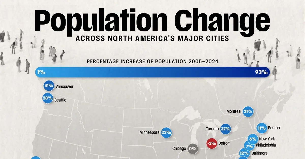
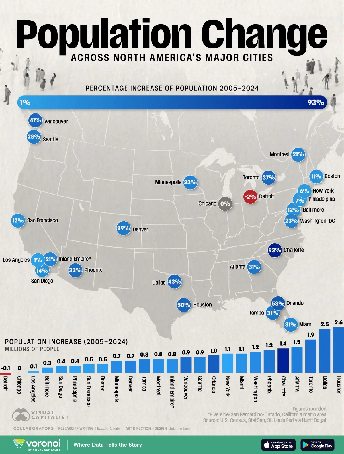
- Charlotte experienced the fastest growth at 93%, rising from 1.5 to 2.9 million residents—the highest percentage gain among major Canadian and U.S. cities.
- Western and southern metros like Phoenix (+33%) and Orlando (+53%) outpaced northern U.S. counterparts such as New York (+6%) and Chicago (0%), underscoring a southward population shift.
Over the past two decades, cities in North America have seen diverging demographic paths.
Cities in the southern and western regions have seen explosive growth, while many northern U.S. metros have expanded at a far slower pace—or even plateaued or declined.
This visualization shows the population change of 25 major North American metro areas between July 2005 and July 2024, both total and percentage changes over the 19-year span using data from the U.S. Census, StatCan, St. Louis Fed via Hanif Bayat.
The Fastest-Growing Cities in the U.S. and Canada Since 2005
Charlotte leads population growth among major North American cities with an astounding 93% population increase, rising from 1.5 to 2.9 million residents.
The data table below shows the population growth in both absolute numbers and a percentage basis for major U.S. and Canadian cities.
| City | Population increase 2005-2024 (millions) | Percentage population change (2005-2024) | Population July 2005 (millions) | Population July 2024 (millions) |
|---|---|---|---|---|
| Charlotte | 1.4 | 93% | 1.5 | 2.9 |
| Orlando | 1.0 | 53% | 1.9 | 2.9 |
| Houston | 2.6 | 50% | 5.2 | 7.8 |
| Dallas | 2.5 | 43% | 5.8 | 8.3 |
| Vancouver | 0.9 | 41% | 2.2 | 3.1 |
| Toronto | 1.9 | 37% | 5.2 | 7.1 |
| Phoenix | 1.3 | 33% | 3.9 | 5.2 |
| Tampa | 0.8 | 31% | 2.6 | 3.4 |
| Atlanta | 1.5 | 31% | 4.9 | 6.4 |
| Denver | 0.7 | 29% | 2.4 | 3.1 |
| Seattle | 0.9 | 28% | 3.2 | 4.1 |
| Washington | 1.2 | 23% | 5.2 | 6.4 |
| Minneapolis | 0.7 | 23% | 3.1 | 3.8 |
| Montreal | 0.8 | 21% | 3.8 | 4.6 |
| Inland Empire* | 0.8 | 21% | 3.9 | 4.7 |
| Miami | 1.1 | 20% | 5.4 | 6.5 |
| San Diego | 0.4 | 14% | 2.9 | 3.3 |
| San Francisco | 0.5 | 12% | 4.1 | 4.6 |
| Baltimore | 0.3 | 12% | 2.6 | 2.9 |
| Boston | 0.5 | 11% | 4.5 | 5.0 |
| Philadelphia | 0.4 | 7% | 5.9 | 6.3 |
| New York | 1.1 | 6% | 18.8 | 19.9 |
| Los Angeles | 0.1 | 1% | 12.8 | 12.9 |
| Chicago | 0.0 | 0% | 9.4 | 9.4 |
| Detroit | -0.1 | -2% | 4.5 | 4.4 |
*Inland Empire refers to the California metro area of Riverside-San Bernardino-Ontario.
Orlando follows at 53%, with Texas metros like Houston (+50%) and Dallas (+43%) ranking third and fourth.
Houston and Dallas have the highest absolute population growth of major American and Canadian cities since 2005 at 2.6 and 2.5 million people respectively.
Canadian Cities’ Population Growth Since 2005
All three of Canada’s major cities (Vancouver, Toronto, and Montreal) had double-digit population growth in percentage terms.
Vancouver’s population rose from 2.2 to 3.1 million, marking a 41% increase, while Toronto expanded more on an absolute basis with 1.9 million new residents, marking 37% growth since 2005.
Montreal’s population grew by 0.8 million people from 2005 to 2024, which was a 21% increase.
Slower Population Growth in the North and Midwest U.S.
Major northern U.S. metros have lagged behind. New York grew just 6%, from 18.7 to 19.8 million people, while Chicago’s population has remained flat over the past two decades.
Detroit was the only city which saw its population decline, with a loss of 0.1 million residents or around a 2% decline in percentage terms.
These slower, flat, and declining population growth rates reflect broader economic shifts—manufacturing decline, high housing costs, and limited land availability—that have pushed growth southward.
This is beyond just these specific cities, as all three states (New York, Illinois, and Michigan) saw their populations decline from 2020 to 2023.
Learn More on the Voronoi App 
To learn more about population changes in countries around the world, check out this graphic which shows European countries’ population changes since 1990 on the Voronoi app.